-
Job Openings Decline in July
The U.S. Bureau of Labor Statistics reported that job openings lowered to 8.8 million
On Tuesday, the number of job openings edged down to 8.8 million on the last business day of July, the U.S. Bureau of Labor Statistics reported. Over the month, the number of hires and total separations changed little at 5.8 million and 5.5 million, respectively. Within separations, quits (3.5 million) decreased, while layoffs and discharges (1.6 million) changed little.
Job Openings
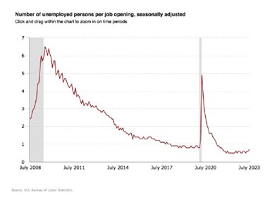
- On the last business day of July, the number of job openings edged down to 8.8 million (-338,000), while the rate changed little at 5.3%.
- Over the month, job openings decreased in professional and business services (-198,000); health care and social assistance (-130,000); state and local government, excluding education (-67,000); state and local government education (-62,000); and federal government (-27,000).
- By contrast, job openings increased in information (+101,000) and in transportation, warehousing, and utilities (+75,000).
Separations
Total separations include quits, layoffs and discharges, and other separations. Quits are generally voluntary separations initiated by the employee. Therefore, the quits rate can serve as a measure of workers’ willingness or ability to leave jobs. Layoffs and discharges are involuntary separations initiated by the employer. Other separations include separations due to retirement, death, disability, and transfers to other locations of the same firm.
The number and rate of total separations in July were little changed at 5.5 million and 3.5%, respectively. Over the month, the number of total separations decreased in accommodation and food services (-132,000).
In July, the number of quits decreased to 3.5 million (-253,000), while the rate changed little at 2.3%. The number of quits declined in accommodation and food services (-166,000); wholesale trade (-27,000); and arts, entertainment, and recreation (-17,000). The number of quits increased in state and local government education (+18,000).
In July, the number of layoffs and discharges changed little at 1.6 million, and the rate held at 1.0%. The number of layoffs and discharges changed little in all industries.
The number of other separations was little changed in July at 378,000.
Establishment Size Class
In July, establishments with 1 to 9 employees saw little change in all data elements. Establishments with more than 5,000 employees had decreases in their quits rates and total separations rates.
-
Market Snapshot – May 2023
Published by Charles Schwab
Given the attention lately on the health of the labor market, that’s the topic for this month’s video, especially in the wake ofwhat was at least on the surface, a better than expected jobs report for April.
Now, let’s start with an important discussion around buckets. Buckets? ‘What is she talking about?’, you probably ask. Well, pretty much every economic data point can be sorted into one of three broad buckets: leading indicators, coincident indicators, and lagging indicators. In addition, there are subsets of leading indicators. In other words, certain data points that lead the common leading indicators. And we’ll get to that in more detail shortly.
Leading Indicators
Initial unemployment claims represents one of those heads up indicators that moves in advance of broader economic trends. This table shows every official recession start point by month back to the late 1960s.In addition, the dates and levels of troughs in the four week average of unemployment claims, as well as the percentage increase in claims leading into each recession start point. This is actually a perfect example of my – probably my favorite adage, which is better or worse, tends to matter more than good or bad when it comes to economic data. Yes, the latest reading of 239,000 for the four week average of unemployment claims is still low in level terms; no question about that. But it’s up more than 25%from the trough, which was last September. And as you can see, the average increase in claims heading into recessions has historically only been 20%. Again, it’s the rate of change that matters at least as much as the level.
Coincident Indicators
Nonfarm payrolls is one such indicator. Now, as you can see, payrolls are actually often still trending higher at the onset of recessions, in part because the NBER, they’re the official arbiters of recessions, they backdate recessions’ starts to at or near whatever the recent peak was in the aggregate data they track, including payrolls. So keep that in mind.
Lagging Indicators
Here’s a long term look at the unemployment rate. I can’t tell you, especially these days, how often I hear something to the tune of there’s no way the economy is at risk of a recession with such a low unemployment rate. Well, as a lagging indicator. The unemployment rate doesn’t foretell recessions. In fact, as you can see, it’s historically been very near its low at the outset of recessions. Maybe put another way, a rising unemployment rate doesn’t bring on recessions. Recessions ultimately bring on a rising unemployment rate. Now, an understanding of the relationship between payrolls and the unemployment rate is also important. The monthly nonfarm payrolls release comes from the Bureau of Labor Statistics establishment survey. That’s what it’s called, which counts jobs. On the other hand, the unemployment rate is calculated from a separate survey called the Household Survey, which counts people. Now, over the past 12 months, the establishment survey suggests that 4.25 million jobs were added, while it’s only 2.7 million jobs per the household survey. Now, some of the differences. The establishment survey includes qualitative assumptions and adjustments tied to seasonality for one, as well as what the Bureau of Labor Statistics calls the birth death model. It’s not of people. It estimates the birth and death of businesses. For what it’s worth, the birth/death assumptions in particular tend to overstate business births and understate business deaths at important inflection points down in the economy. In addition, again, for what it’s worth, the household survey does tend to be more accurate around those same inflection down points with the establishment survey data ultimately subject to pretty significant revisions to prior releases. In fact, related to that, the April jobs report showed payroll growth that was stronger than expected. However, there were significant revisions to the prior two months data. In fact, the downward revision to March’s data was about the same amount by which the April data beat expectations. Keep that in mind.
Now, in another sign of at least a loosening up of what has been a very tight labor market, the prime age labor force participation rate continues to move higher and actually finally surpassed the pre-pandemic peak. Now, this at least, is in keeping with what the Federal Reserve is looking for to help bring inflation down.
Now, another component of the labor market tied to the ongoing inflation problem is wage growth not yet approaching what might be considered the Fed’s comfort zone. As of April, average hourly earnings were slightly higher than the prior month. Keep in mind, though, that this is an average and is likely skewed lower by something called the mix shift. I’ll explain that in a moment. Because of this, we also need to look at median measures of wage growth, not just average measures. And we can look at a median courtesy of the Atlanta Fed Wage Growth tracker as it’s called. Now you see a meaningful divergence between these two measures recently, and that’s because layoffs to date have been disproportionately biased toward higher wage jobs within higher wage industries. So get back to the average thing and the mix shift. What happens when you take a bunch of high numbers out of an average? The average goes down. A median measure is not biased as such. Hence the spread between the two. And we can look at this in a little more detail here. This plots average hourly earnings against payroll growth for each defined sector. And the mixed shift effect is in play. If you look at the information and education slash health services sectors as two examples. Information, as you can see, is the highest paying sector, but job creation was the weakest in April. Conversely, the education/health services sector is in the middle of the pack in terms of hourly earnings, but had the strongest job growth last month.
Finally, we can move on to the recent release of data from the JOLTS report, that stands for the Job Opening and Labor Turnover Survey. Job openings fell from nearly 10 million in February to less than 9.6 million in March. By the way, the data lags other labor market data by a month. That’s why we’re talking about March data and not April. Put another way, the job openings rate fell to 5.8%,keeping its swift move off the peak in places you can see. Now, the rolling over in job openings has been a key supporting factor for those hoping for a soft landing. But that wasn’t the case in March. Given that the layoffs and discharge rate rose sharply. If we continue to see this, it would confirm that the reduction in job openings is consistent with a recession or hard landing, not a soft landing.
In summary, unemployment claims lead with job openings and layoffs leading those. Payrolls are a coincident indicator, also subject to revisions and adjustment vagaries. And the unemployment rate lags. In keeping with what the Fed wants to see, the labor force participation rate is moving higher, but wage growth may still be a little too hot. Unique in this cycle is the “top down”, as I’ve been calling it, or higher wage nature of layoffs to date. But of course, so many things are unique in this pandemic-afflicted cycle. My final thought is to remind viewers that it’s often the case that better or worse matters more than good. Keep that in mind as you look at economic data to judge just where we are in this unique cycle.